반응형


# 파이썬 라이브러리 임포트
from __future__ import absolute_import, division, print_function, unicode_literals, unicode_literals
import tensorflow as tf
from tensorflow import keras
import numpy as np
import matplotlib.pyplot as plt
# 패션 mnist 데이터 로드
fashion_mnist = keras.datasets.fashion_mnist
(train_images, train_labels), (test_images, test_labels) = fashion_mnist.load_data()
# 이미지 출력시 필요한 변수 저장
class_names = ['T-shirt/top', 'Trouser', 'Pullover', 'Dress', 'Coat',
'Sandal', 'Shirt', 'Sneaker', 'Bag', 'Ankle boot']
# 데이터셋 구조 확인
train_images.shape # 60,000개의 이미지/ 28x28 픽셀
len(train_labels) # 60,000개의 레이블
train_labels # 레이블은 0~9 사이의 정수
test_images.shape # 10,000개의 이미지/ 28x28 픽셀
len(test_labels) # 10,000개의 레이블
# 데이터 전처리
plt.figure() # 새로운 figure 생성
plt.imshow(train_images[0]) # train_images[0]의 이미지 보여주기
plt.colorbar() # colorbar 생성
plt.grid(False) # grid - 나눔표? 생성
plt.show() # 생성한 모든 figure 보여주기
train_images = train_images / 255.0
test_images = test_images / 255.0
# train_images 에서 첫 25개 이미지/클래스 이름 출력
plt.figure(figsize=(10,10))
for i in range(25):
plt.subplot(5,5,i+1)
plt.xticks([])
plt.yticks([])
plt.grid(False)
plt.imshow(train_images[i], cmap=plt.cm.binary)
plt.xlabel(class_names[train_labels[i]])
plt.show()
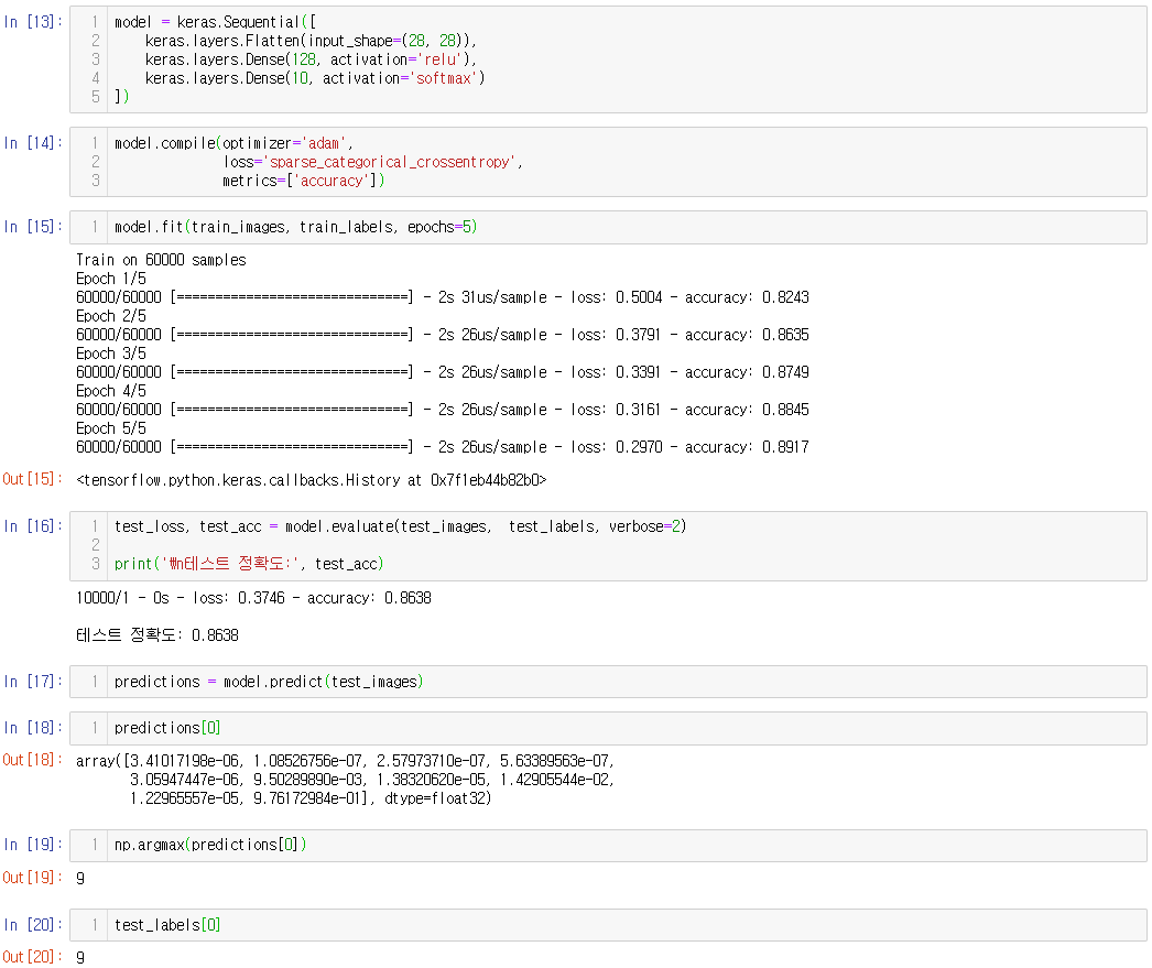
# layer 설정
model = keras.Sequential([
keras.layers.Flatten(input_shape=(28, 28)), # 2차원 배열의 이미지 포멧을 28*28 의 1차원 배열로 변환
keras.layers.Dense(128, activation='relu'),
keras.layers.Dense(10, activation='softmax')
# 모델 컴파일 - loss function / optimizer / metrics 설정
model.compile(optimizer='adam',
loss='sparse_categorical_crossentropy',
metrics=['accuracy'])
])
# 모델 훈련
model.fit(train_images, train_labels, epochs=5)
# 정확도
test_loss, test_acc = model.evaluate(test_images, test_labels, verbose=2)
print('\n테스트 정확도:', test_acc)
# 예측 생성
predictions = model.predict(test_images) # 테스트 세트에 있는 각 이미지의 레이블을 예측
predictions[0]
np.argmax(predictions[0]) # 가장 높은 신뢰도를 가진 레이블 예측
test_labels[0]
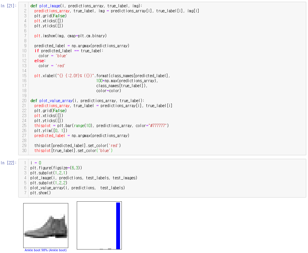
def plot_image(i, predictions_array, true_label, img):
predictions_array, true_label, img = predictions_array[i], true_label[i], img[i]
plt.grid(False)
plt.xticks([])
plt.yticks([])
plt.imshow(img, cmap=plt.cm.binary)
predicted_label = np.argmax(predictions_array)
if predicted_label == true_label:
color = 'blue'
else:
color = 'red'
plt.xlabel("{} {:2.0f}% ({})".format(class_names[predicted_label],
100*np.max(predictions_array),
class_names[true_label]),
color=color)
# 10개 그래프에 대한 예측 그래프로 표현
def plot_image(i, predictions_array, true_label, img): # 그래프로 표현하는 함수
predictions_array, true_label, img = predictions_array[i], true_label[i], img[i]
plt.grid(False)
plt.xticks([])
plt.yticks([])
plt.imshow(img, cmap=plt.cm.binary)
predicted_label = np.argmax(predictions_array)
if predicted_label == true_label:
color = 'blue'
else:
color = 'red'
plt.xlabel("{} {:2.0f}% ({})".format(class_names[predicted_label],
100*np.max(predictions_array),
class_names[true_label]),
color=color)
def plot_value_array(i, predictions_array, true_label): #
predictions_array, true_label = predictions_array[i], true_label[i]
plt.grid(False)
plt.xticks([])
plt.yticks([])
thisplot = plt.bar(range(10), predictions_array, color="#777777")
plt.ylim([0, 1])
predicted_label = np.argmax(predictions_array)
thisplot[predicted_label].set_color('red')
thisplot[true_label].set_color('blue')
# 0번째 이미지 출력 및 신뢰도 점수의 배열을 이미지로 출력
# plt.subplot - 한개의 화면에 여러 그래프 나눠 그리기
# 파랑색 - 올바른 예측
# 빨강색 - 잘못된 예측
i = 0 # 0번째 이미지 사용
plt.figure(figsize=(6,3)) # 이미지 사이즈 (6,3)
plt.subplot(1,2,1) # 121 - 1*2 로 나눈 것중 1번째 그림
plot_image(i, predictions, test_labels, test_images)
plt.subplot(1,2,2)
plot_value_array(i, predictions, test_labels)
plt.show()
# 처음 X 개의 테스트 이미지, 예측 레이블, 진짜 레이블 출력
num_rows = 5
num_cols = 3
num_images = num_rows*num_cols
plt.figure(figsize=(2*2*num_cols, 2*num_rows))
for i in range(num_images):
plt.subplot(num_rows, 2*num_cols, 2*i+1)
plot_image(i, predictions, test_labels, test_images)
plt.subplot(num_rows, 2*num_cols, 2*i+2)
plot_value_array(i, predictions, test_labels)
plt.show()본 게시물은 https://www.tensorflow.org/tutorials/keras/classification?hl=ko 을 참고하여 작성하였습니다.
반응형
'-------------코딩------------- > Tensorflow & pandas' 카테고리의 다른 글
| 데이터 중복 제거 duplicated() (0) | 2020.05.25 |
|---|---|
| NA(Not Available) 처리 메서드 (0) | 2020.05.25 |
| pandas.read_csv 한글 깨짐 (0) | 2020.05.13 |
| tensorflow 2.0 mnist간단 모델(가이드 - 초보용) (0) | 2020.01.17 |
| tensorflow 2.0 기본 사칙연산 (0) | 2020.01.11 |


댓글